
The Problem captured
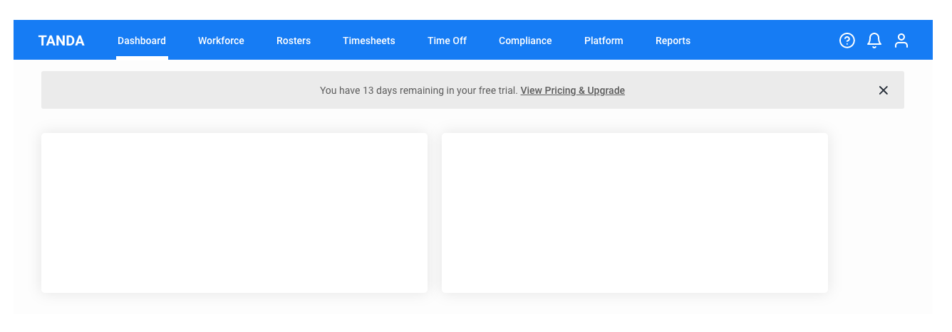
Non-systematic, inconsistent UI elements makes visual disruption.
In details:
1. Colours been used without proper design thinking process.
2. Navigation doesn't catch your eye
3. Inconsistency in layout
The Challenge
Improve usability, intuitive navigation and providing human-centred design methodology with Design Thinking Process.
Main goal to achieve from this design thinking process is to improve the interface looks modern, human-centred approach. From this exercise, I recommend the top 3 high level goals for quick wins.
The high level goals are to:
1. Refine the tone of the colours in overall
2. Intuitive navigation
3. Review the layout
'Visual Concepts are real hero'
The Solution
1. Refine the colour tone
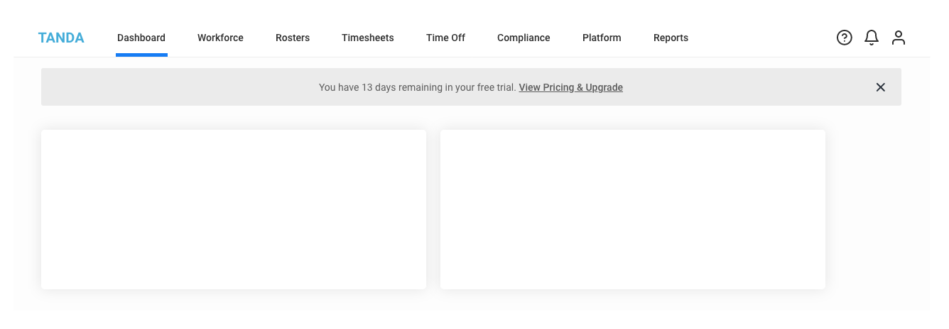
Tone of the colours are the colour spectrum range between the pure black to clear white. Mainly designer choose the range depends on the colour strength decision how much range the product should take. Easiest way to see the tone spectrum range is converting the captured screen into black and white as below.
Dashboard Screenshot converted to grey mode
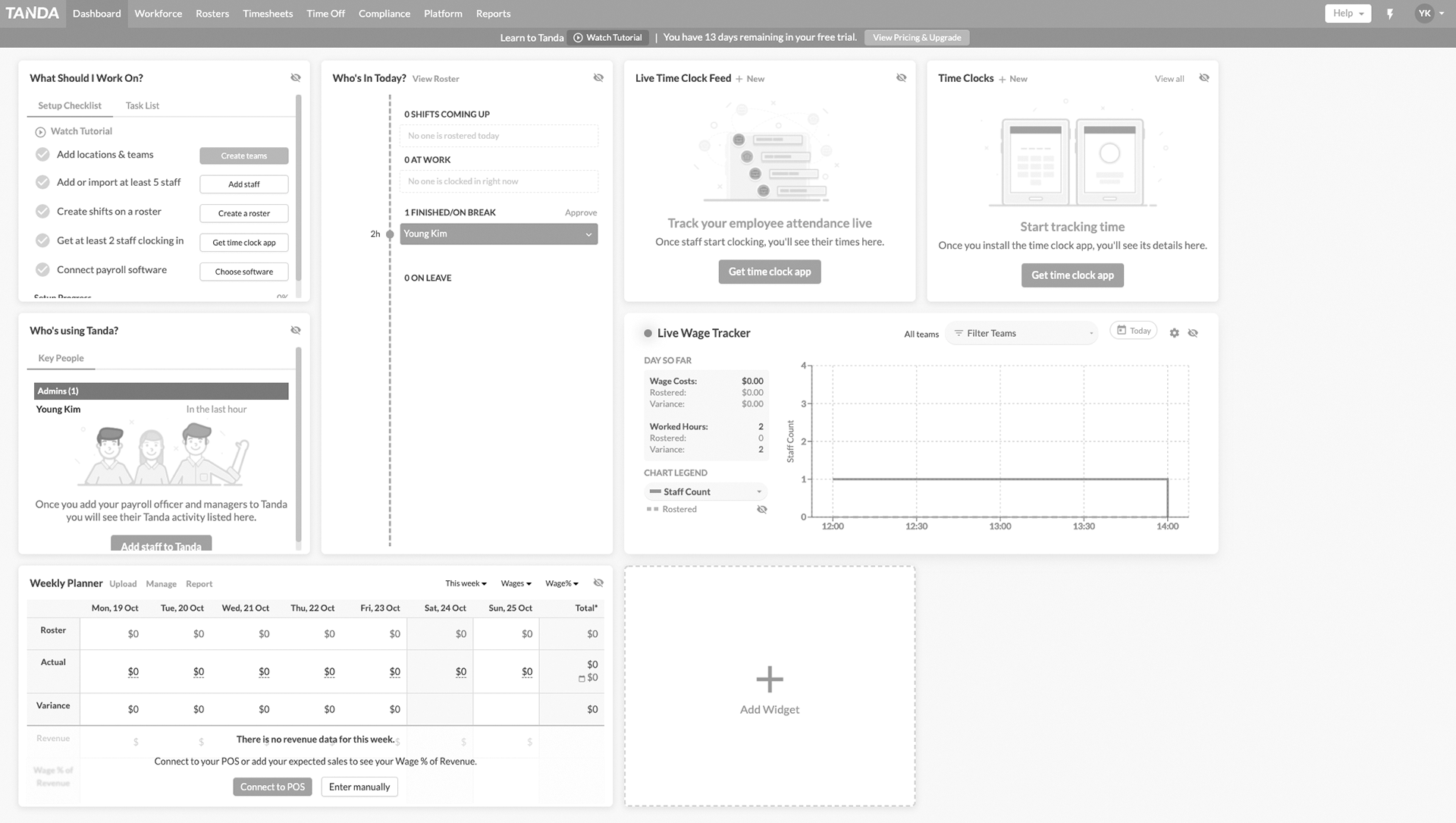
Dashboard screen captured that converted to black and white
Tone spectrum captured
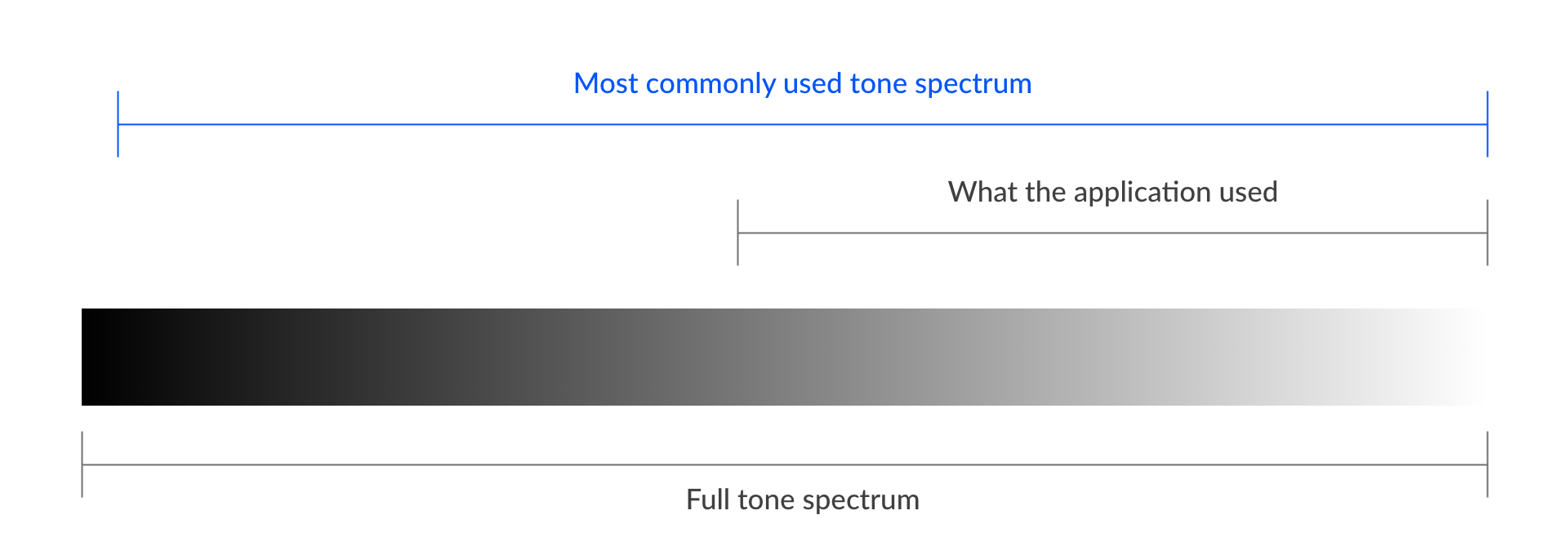
Colour tone spectrum with suggested the tone of primary colours
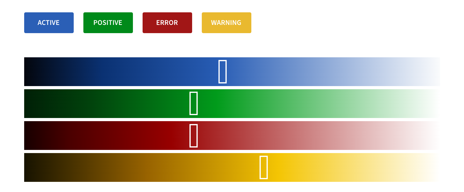
As above, the application only took less than half of the range available and it makes the overall tone looks weak. the most commonly used tone is also guided for further consideration.
Colour ranges however in full colour spectrum, should be considered with proper design system.
** This study is also helpful for colour-blindness.
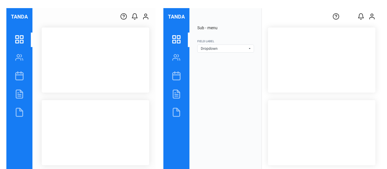
2. Intuitive navigation
From the study about tone refinement above will help the stronger visual representation for the menus that allows intuitive access. However it seems brand colour is used for the background colour and it does not gives enough contrast tone from the text.
1. the brand colour should not be used as the background colour.
2. To make the stronger visual representation, darker or brighter background colour could be an option to be considered.
3. Set the menu typography type, size and button behaviour with design system.
4. Vertical menu type with iconography could be an option.
** With usability and A/B testing can give you which type is the most practical solution.
Mockup 1 - Solid Dark colour type
Mockup 2 - Solid White colour type
Mockup 3 - Vertical menu (with iconography) type
3. The layout
A great application is powerful and, at the same time, simple. Through carefully balanced feature selection and presentation in layout, you can achieve both power and simplicity.
What makes an application powerful?
An application is powerful when it has the right combination of these characteristics:
1. Efficient - The application enables users to perform tasks with easy of access.
2. Direct - The application layout directly helping users instead of requiring unnecessary steps. Features like shortcuts, keyboard access improve the sense of directness.
3. Flexible - The application layout allows users in any of web browsers.
What makes a user experience simple?
Simplicity is the reduction or elimination of an attribute of a design that users are aware of and consider unessential.
Design techniques
To obtain simplicity while maintaining power, choose the right set of features, locate the features in the right places, and reduce the effort to use them.
Remove unnecessary elements. Remove elements that aren't likely to be used or have preferable alternatives.
Put the elements in the right place.
Keep the consistency in all elements and features throughout the pages.
Make the rules of spaces all around on each elements and test, validate the design rules in any combinations
The high-level application layout maps
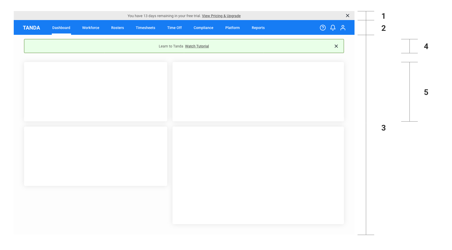
1. Global Notification sector
2. Main navigation
3. Workspace
4. Temporary notification / messages
5. Inner-card sector
And this study shouldn't stop here...
So, what's next?
I am very keen to learn more about the product and want to be part of this exciting journey. With my skills, knowledges and passion, I will be a good part of the team for sure.
Reach me out anytime, I am ready to answer any complex questions!
0411 713 626 / imagehubs@gmail.com
Young Kim