
The Main Goal
Propose the genuine value and the solutions by conducting the visual audit and identifying the UX problems
Human-centred design in particular, focusing on people's everyday thinking, emotions, and behaviour. It is a creative approach to problem-solving that involves the end-user.
From the perspective, I suggest the below 3 key challenges will deliver the product to the next level.
1. Colour
Refining the current colours used only for this exercise.
2. Intuitive users flow
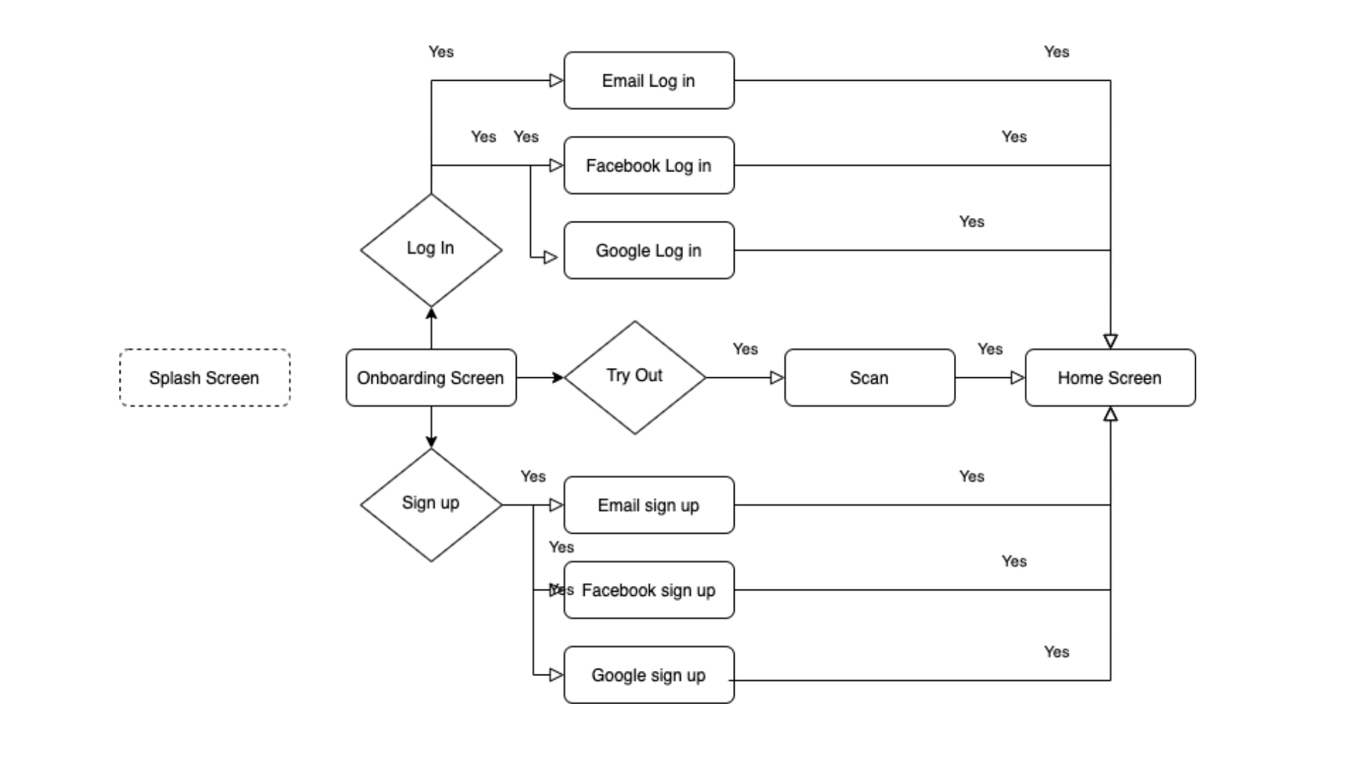
Capture the current users flow, state the problems, propose intuitive users flow (Splash - Onboarding - Home screens)
3. Suggestion - Brand Identity
Logo revision only as part of brand identity exercise
1. Colours used
The problems
Below diagrams shows the primary, secondary and neutral colours used on the current app. However, it doesn't seems there is much colour variation or solid colour system applied. I also noticed the neutral colour set is more 'Bluish-gray' tone. No pure gray.
The best idea to collect right colours and brightness, start with mid-range colour set (here I figured it to 500 (range from 900 to 100)) and convert it to gray-scale view. It is always a good method to see easily the 'tone' of the colours.
Summary of the problems captured:
1. Colours picked looks not rich and vivid.
2. No colour variation found.
3. Colours are not scalable.
4. Mixture of core colours and primary/secondary

1. Colour theme suggest
The Solution
1. Re-pick the colours (vivid and rich look) to make it modern style (This is more on Designer's choice!).
2. Set the colours from the mid-range (500) to compare the brightness to others.
3. Prepare the colours in variation
4. Preset the basic/core system colours use for scalability

2. Complex Users Flow
Current Information Architecture captured
Current users flow is too complex. Some of the pages have too many functions on a single page and it should be allocated to where it most related other pages.
The problems
The major problems I captured:
1. Splash screen is not available
How does this help?
- Brand Loyalty, Trust, Engagement
- Improving UX - Allow the system to identify the user type and can lead to the right pages.
2. Too complex onboarding process
3. Visual identification difficulties to distinguish login and sign up
4. Is there security provided on revisit process (Session never expires?)
5. Mis-located biometric login
6. 'Try out' option is too dominant?
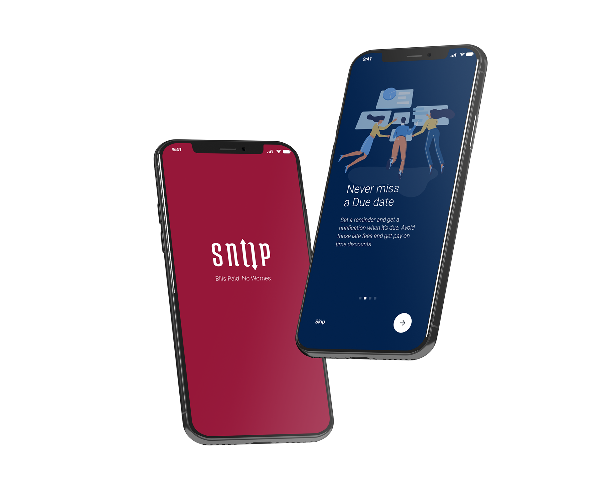
Current Onboarding process Screen Flow
Splash screen isn't a must. But has more benefit from this process allows the moment to preload heavy data for smooth transition to the next. Also allows the moment to identify the user's type (new or exist) so the onboarding process can be shortened.
I also noticed the visual disruption on having same layout for both onboarding and home screens makes confuse the user.
The problems
1. Visual disruption having same layout/style for both onboarding and home screen
2. Intuitive Users Flow
Simple and intuitive Information Architecture
Grouped each progress gives more benefit on management, overview and easy of re-engineering.
Having splash screen will allow the user two choices, onboarding or log in. Loading/progress bar will appear only when there is unexpected delays behind the scene.

The Solutions
1. Splash screen - Take the parts from the onboarding process
2. Simple/quick and clear message on onboarding process
3. Add Biometric login method for quick login and revisit
4. Colour differentiated each process in group
5. Apply the different user/app flow and experience on login and signup
6. Try out with tour process to engage more customers
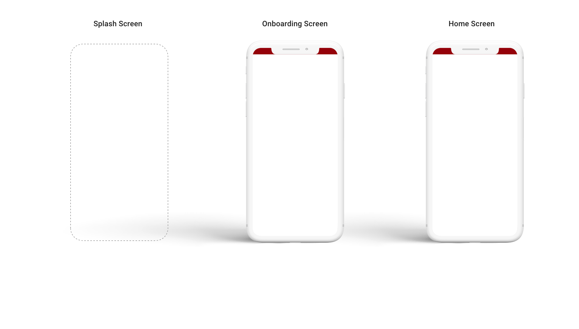
Visually identified each stage Screen Flow
In a high-level groups of progress categorised with background colour allows user knows which stage you are in.
Splash screen - Sniip Red
Onboarding screens / Log in - Sniip Blue
Home Screens - Sniip White

3. Suggestion - Brand Identity
What is brand identity?
Brand identity is the collection of all elements that a company creates to portray the right image to your customer. Successful brand identity translates into a positive brand image.
Why is it important?
A strong brand identity positions you in the mind of your customer as providing quality worth paying for.
How to develop a strong brand identity?
To develop a strong brand identity start with 'Know who you are' as a brand and that made up of a few key elements.
1. Mission
2. Values - what beliefs drive your company
3. Brand personality
4. Unique positioning - how do you differentiate yourself
5. Brand voice
"For this exercise I mainly focused on logo design part only".
The concerns
1. Overly complex
2. The font doesn't tell much characteristics
3. Not scalable / Registered mark disappeared

The Suggestions
"This exercise is purely my suggestion and need to revisit this with proper study of the business".
1. Simplify the logo type
2. Choose the right font
3. Add characteristics
4. Make the logo scalable
5. Bring on the strong belief
Font type study

Logo type variation

Mockups from the study

And, what else?
A lot more UI study, UX research required
Typography, sizing and spacing, imagery, UI patterns, library and a lot more UX research required to complete this exercise....
I am very keen to learn more about the product and want to be part of this exciting journey. With my skills, knowledges and passion, I will be a good part of the team for sure.
Reach me out anytime, I am ready to answer any complex questions!
0411 713 626 / imagehubs@gmail.com
Young Kim